One of the exciting working groups from the 2013 Evergreen Hack-A-Way was working towards building a more responsive web catalog, specifically with mobile devices in mind. With our git powers and making extensive use of Firefox’s handy native Responsive Design View mode, we took our enthusiasm to task and hacked out some initial design changes to make the next generation Evergreen catalog much more mobile friendly.
Based on work initiated by Dan Scott (Laurentian University), Jason Boyer (Evergreen Indiana) had already created more media query changes for the catalog to make it even more responsive along with other changes for Indiana’s catalog. Ben Shum (Bibliomation) worked with Jason to rebase his code against master instead of 2.2. Along the way, other team members also began picking interested areas to begin coding for: Kathy Lussier (MassLNC) decided to look the My Account areas and worked to fix the top dashboard buttons and worked on the sub-tab menus. She was assisted by Dan Pearl (C/W MARS). Bill Ott (Grand Rapids Public Library) focused on the advanced search filters and changing them from <table> tags to <div> tags to allow them to be styled more responsively. Garry Collum (Kenton County Public Library) worked on contributing style changes to highlight individual copy entries on the record details pages. Dan Scott was actually working remotely the whole time and made use of Google+ Hangouts to provide the group with design guidance and wonderful company. He also contributed code changes to make the results page operate smoothly by altering the appearance of facets, the place hold / add to my list links, and numerous other changes around the whole catalog.
All in all, the work was done publicly via collaborative git working branch. We are still pushing new changes, but this is a quick link to the existing working branch on the Evergreen community git server with the initial code commits: http://git.evergreen-ils.org/?p=working/Evergreen.git;a=shortlog;h=refs/heads/collab/bshum/mobile-cat-hacking
So now for the fun stuff, screenshots showing new changes! The following screenshots are taken with a standard installation of Evergreen (running master) on the left and then the mobile catalog work on the right.
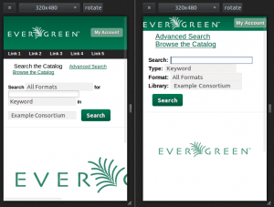
1) Home page (aka, Basic Search) – Restyled the elements for the basic search to have labels (Search, Type, Format, Library) preceding the related option. The logo and “my account” buttons are more fitting to increase overall screen real estate. The homesearch main logo below fits on the screen.
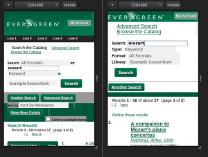
2) Results page – in the next screenshot, we did a sample search for “mozart” against the same concerto sample dataset. On the left, see how all the block elements are scattered against the screen and unorganized. On the right, the revised screenshot keeps the very simple design. (Note: keep your eye on the “refine these results” text, that’s important in the next screenshot)
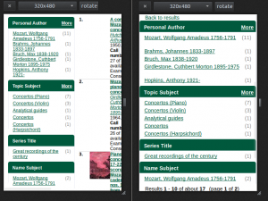
3) Facets – on the left, the facets still appear to the left of the search result entries. Instead for mobile view, on the right we’ve changed the facets to be hidden by default and only appear whenever the “refine these results” link is pressed from the previous screenshot. There’s now a new link for “Back to results” if you do not select a facet to refine your links as well. (Special Note: there are ideas to make the refine link more prominent)
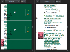
4) More results page changes – So, on the left, the text for “Place Hold”, “Add to my list”, and parts of the title/author disappear into the green background, which you get to when you scroll across to the side to view more stuff that didn’t make it onto the page. On the right, we have cleaned up the results view and you can see the title (the font is bigger to make it easier to click on), author, details more clearly. The “Place Hold” and “Add to my list” buttons drop down to below the result details making them easy to reach.
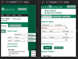
5) Advanced Search – On the left, the advanced search entry boxes don’t even show up on the screen because they’ve drifted too far to the right side. Now, you can see on the right that we’ve cleaned them up so that they wrap neatly and also have some dividers between search terms.
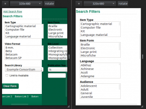
6) Advanced Search Filters – On the left, the filters are still stacked and require scrolling from left to right to view all of the various filter options. With the restyled view on the right, the filters are all stacked neatly one on top of the next and scrollable from top to bottom to select choices. (Special Note: While the view shows the full filter listings, we tested the mobile look with iOS and Android. With both, there’s a little popup selector widget that allows you to choose options that shows when you click on them.)
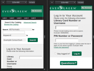
7) Login Page for My Account – On the left, the login page looses half the screen real estate with the search boxes and you can’t easily see the login box and password without scrolling down. On the right, we’ve hidden the search boxes and put the login / password boxes first.
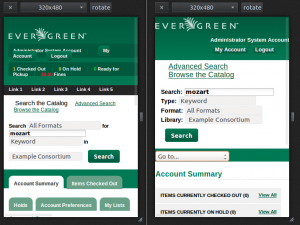
8) My Account view – On the left, you can see how the dashboard box is confusingly arranged and disoriented. There are also lots of tabs along the button that wrap strangely and may be confusing. To simplify, on the right, you can see we’ve replaced the top with two simple buttons for quick back to “My Account” and “Logout”. The tabs below were replaced with a dropdown “Go to…” selector that will take you to the different parts of the my account areas. Next step here might be removing the search boxes as well but maybe provide a quick link / button back to search…
So that’s all we have to showcase for this blog post for now. But stay tuned, there is lots more exciting work to be done moving forward. This has been a gigantic leap forward for the future mobile catalog and we look forward to working with others and sharing the cool things we can do very soon.
Thanks to Calvin College and Equinox for hosting this Hack-A-Way and providing a space for developers to come together and hack on cool Evergreen code.
— the mobile catalog hacking team:
Jason Boyer, Evergreen Indiana
Garry Collum, Kenton County Public Library
Kathy Lussier, MassLNC
Bill Ott, Grand Rapids Public Library
Dan Pearl, C/W MARS
Dan Scott, Laurentian University
Ben Shum, Bibliomation

